What Makes a Website Convert? 7 Things Most Sites Get Wrong
Why your website isn't converting visitors into customers. 7 common conversion killers and how to fix them, with real before-and-after examples.
A website that gets traffic but no enquiries is an expensive billboard. Pretty to look at, maybe. But pointless.
Conversion isn't magic. It's not about secret psychological tricks or manipulative dark patterns. It's about removing the friction between "I found your site" and "I want to work with you." Most sites add friction without realising it.
Here are the seven things I see killing conversions on nearly every small business website I audit in Brighton and beyond.
1. The Homepage Doesn't Say What You Do
This is the biggest one. A visitor lands on your homepage and within three seconds cannot answer the question: "What does this business do?"
Instead of a clear statement, they see:
- "Innovative solutions for modern challenges"
- "Transforming your vision into reality"
- "Where quality meets excellence"
These say nothing. They could apply to a dentist, a marketing agency, or a sandwich shop.
Your homepage headline should be brutally specific. "We build loft conversions in Sussex." "Personal training in Chelsea and Mayfair." "Custom websites for Brighton businesses." Three seconds, total clarity.
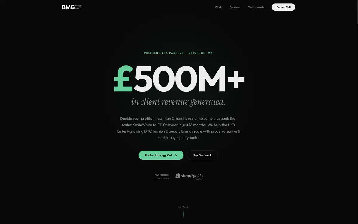
When I redesigned Brighton Marketing Group, the original site was dense with information but weak on clarity. We stripped it back to one clear narrative: here's what we do, here's proof, here's how to start. Less content, more conversions.
2. The Call to Action Is Buried
Every page should have an obvious next step. Not five steps — one. And it should be visible without scrolling.
I audit sites where the contact form is on the last page of the navigation. Where the phone number is in the footer only. Where "Get a Quote" is in 12px grey text that blends into the background.
If the most important action on your site requires hunting, you've already lost. The primary CTA should be:
- In the navigation (always visible)
- In the hero section (above the fold)
- Repeated after every major content section
- In the footer
Not aggressively. Not with flashing buttons. Just present. Always available. The moment someone decides to get in touch, the mechanism should be right there.
3. No Social Proof Above the Fold
Humans are herd animals. We trust businesses that other people trust. Testimonials, reviews, case study results, client logos — these are conversion tools, not decoration.
And they need to appear early. Not buried on a "Testimonials" page nobody visits. On the homepage, above or just below the fold.
The most effective pattern I've found: one strong testimonial quote with a real name, positioned directly below the hero section. It validates everything the headline just promised.
"Don't tell me you're good. Show me someone else saying it."
4. It's Too Slow
A site that takes more than 3 seconds to load loses 53% of mobile visitors, according to Google's own research. That's not a gradual decline — more than half your potential customers leave before seeing anything.
Speed is the invisible conversion factor. Nobody consciously thinks "this site is fast, so I trust this business." But they absolutely notice when it's slow. Slow feels broken. Slow feels amateur. Slow feels like the business doesn't care.
Most sites are slow for predictable reasons: unoptimised images, unnecessary JavaScript, bloated WordPress themes, third-party scripts loading synchronously. None of these are hard to fix.
Every site I build scores 90+ on Google Lighthouse because performance is baked into the architecture from the start, not bolted on as an afterthought.
5. Mobile Is an Afterthought
Over 60% of web traffic in the UK is mobile. In some industries — restaurants, salons, local services — it's 80%+. If your site doesn't work beautifully on a phone, most of your visitors are having a bad experience.
"Responsive" isn't enough. A desktop layout squeezed onto a phone screen is technically responsive but practically unusable. Mobile design needs to be intentional:
- Tap targets big enough for thumbs (44px minimum)
- Phone numbers that are tappable
- Forms that don't require pinch-zooming
- Content in a single column with clear hierarchy
- Navigation that's thumb-reachable
I've seen sites where the "Request a Quote" button was 200px from the bottom of the screen on mobile — unreachable without stretching. That's not responsive. That's negligent.
6. There's No Clear Path Through the Site
A visitor should never wonder "what am I supposed to do next?" Every section should lead to the next. Every page should have a logical follow-up.
The structure I use for most small business sites:
- Hero — What you do + CTA
- Social proof — Why to trust you
- Services — What you offer
- Portfolio/Work — Proof you can deliver
- Process — How it works
- Testimonials — More trust
- Contact — The action
Each section answers the visitor's evolving question. "What is this?" becomes "Can I trust them?" becomes "What do they offer?" becomes "How does it work?" becomes "How do I start?"
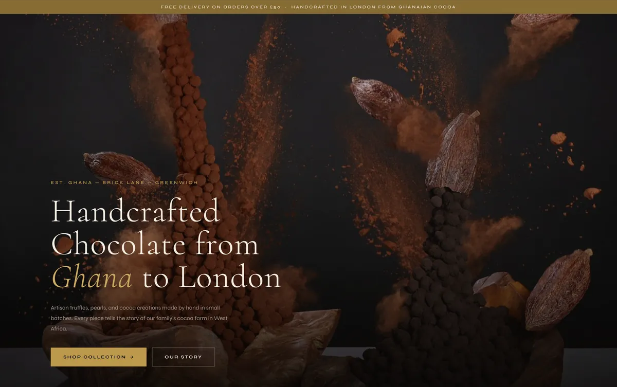
When Dark Sugars needed a redesign, the original Shopify template didn't guide visitors anywhere. It was a grid of products with no narrative. We rebuilt it to pull visitors through the brand experience — atmosphere first, products second, desire to visit last.
7. The Copy Is About You, Not Them
"We have 20 years of experience." "We are passionate about quality." "We use the latest technology."
Nobody cares about you. They care about themselves. Every line of copy should answer the visitor's real question: "What's in it for me?"
Rewrite "We have 20 years of experience" as "Your project is backed by 20 years of expertise." Rewrite "We are passionate about quality" as "You get a finish that lasts." Rewrite "We use the latest technology" as "Your site loads in under a second."
Same facts. Different frame. One is a press release. The other is a promise to the customer.
The Compound Effect
No single fix will double your conversions overnight. But each of these seven issues is a leak. Fix them all and the compound effect is dramatic.
A site that loads fast, says what it does clearly, shows social proof early, guides visitors through a logical path, speaks to their needs, works on mobile, and makes it dead easy to get in touch — that site converts. Not because of tricks. Because of respect for the visitor's time and attention.
If your site gets traffic but not enough enquiries, the answer is almost always one or more of these seven problems. And they're all fixable.
Want me to take a look? Book a call and I'll tell you what I'd change.
Traffic without conversion is just a crowd walking past your shop window.